Logo
Primary Logo
This is the primary brand logo, and should be used in all scenarios when possible. The logo should always be used against a white, or light background when possible. This applies to both web and print mediums.
Secondary Logo
This secondary brand logo should only be used in situations when the simplified horizontal layout is required.
Stacked Logo
Additional Layouts and Taglines
Icon
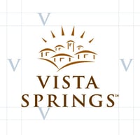
Safe Zone


Please observe the illustrated safe zone around the Vista Springs logo. This area around the logo must remain clear of other design elements when using the Vista Springs logo.
Use the "V" in Vista as a guide for spacing around the logo.
Logo Misuse


The Vista Springs logo may not be edited or altered in any way. Do not alter, recolor, rotate, transform, edit, or crop the Vista Springs logo.
When inserting the Vista Springs logo, maintain dimensions. To do this on most applications, hold down the shift key as you resize the image.
The full-color Vista Springs logo should not be used when applied to a dark background. In these cases, use the white Vista Springs logo. Do not add drop shadows to any Vista Springs logo.
Colors
Primary Colors
Hex: #B3C6D5
RGB: 179, 198, 213
Hex: #6B8CC2
RGB: 107, 140, 194
Hex: #345389
RGB: 52, 83, 137
These are the primary brand colors for Vista Springs and should make up the majority of materials designed for our communities, web or print-based.
Secondary Colors
Hex: #7E858D
RGB: 126, 133, 141
Hex: #A18F81
RGB: 161, 143, 129
Hex: #bebb93
RGB: 190, 187, 147
Hex: #F4B896
RGB: 244, 184, 150
Hex: #F4DCB4
RGB: 244, 220, 180
Footer Title
These secondary colors can be used to accent and add depth and interest to materials designed for Vista Springs and our communities. These colors shouldn't overtake the design and should only be used to enhance the design.
Typography
Primary Typeface
Secondary Typeface
Imagery
Photography


Image Tone
- Bright
- Modern
- Cheerful
- Diverse
- Natural Light
- Community
- Warm
- Comforting
Note: Images of residents who've moved out or are deceased may need to be removed and the images updated over time.
Stock Photography


Image Tone
- Bright
- Modern
- Cheerful
- Diverse
- Natural Light
- Community
- Warm
- Comforting
Icons
Icons use the primary Vista Springs blue and should be simple designs that are easy to understand and add to the message of the associated text.
Messaging / Voice
Messaging
We are Full of Life!
Vista Springs is a vibrant community. We offer more than quality care to our community members. We offer community members vibrant, active lives through community activities and resort-style amenities.
Our messaging should convey that our communities, team, and residents are full of life!
Voice
Friendly & Knowledgable
Vista Springs is a source of community and knowledge for senior living and care options. The voice of our communications is professional and knowledgable while still being friendly and approachable.
At Vista Springs, the seniors in our communities are community members or residents, not patients.
We never assume someone's relation to a senior and use the neutral term, "loved one" in the content used with individuals seeking care for a senior.
We prefer the term "senior" over "elderly" or "elderly person."
Tone
Bright, Cheerful, Understanding, & Comforting
Vista Springs is a warm, inviting place for our community members and their families. We want to maintain a cheerful tone while also being mindful of seniors and their families who may be struggling with difficult decisions, moves, or diagnoses.


